Planow
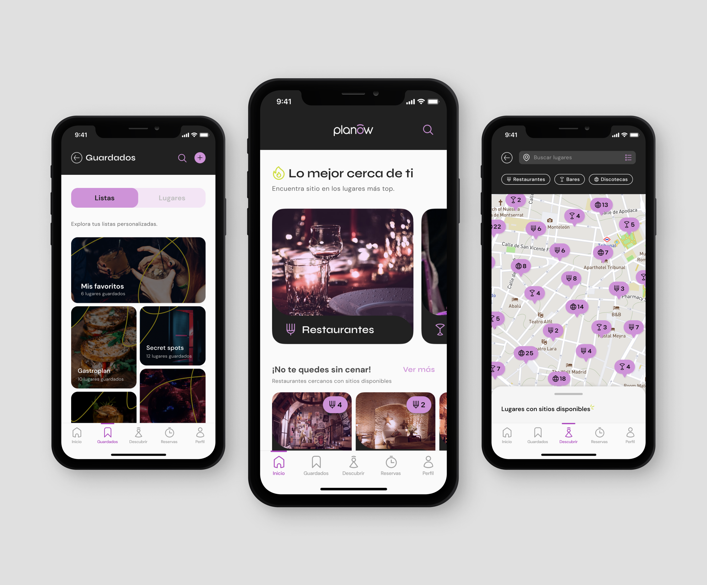
Planow is an app that allows you to make table reservations or check if there are available seats in the best places, completely live.
Planow makes last-minute plans a success, whether you're enjoying your favourite bar or discovering new places to have fun in the area.
Making last-minute plans in the centre of Madrid is often an impossible task. It is very likely that most places are full or that users don't know where to go at the last minute. They could be missing out on new top places to discover!
To ensure a smooth and efficient user experience. Key challenges include:
Real-time installation systems must be responsive.
Users expect immediate contact when booking or checking availability.
Creating an intuitive and user-friendly interface that allows users to quickly browse available resources, organize and manage their bookings, and include an information system that lets users know about their reservations, changes, or cancellations is essential to a positive user experience.
Implementing a system for users to leave feedback and reviews can be beneficial but also challenging, as it requires monitoring and addressing user comments.
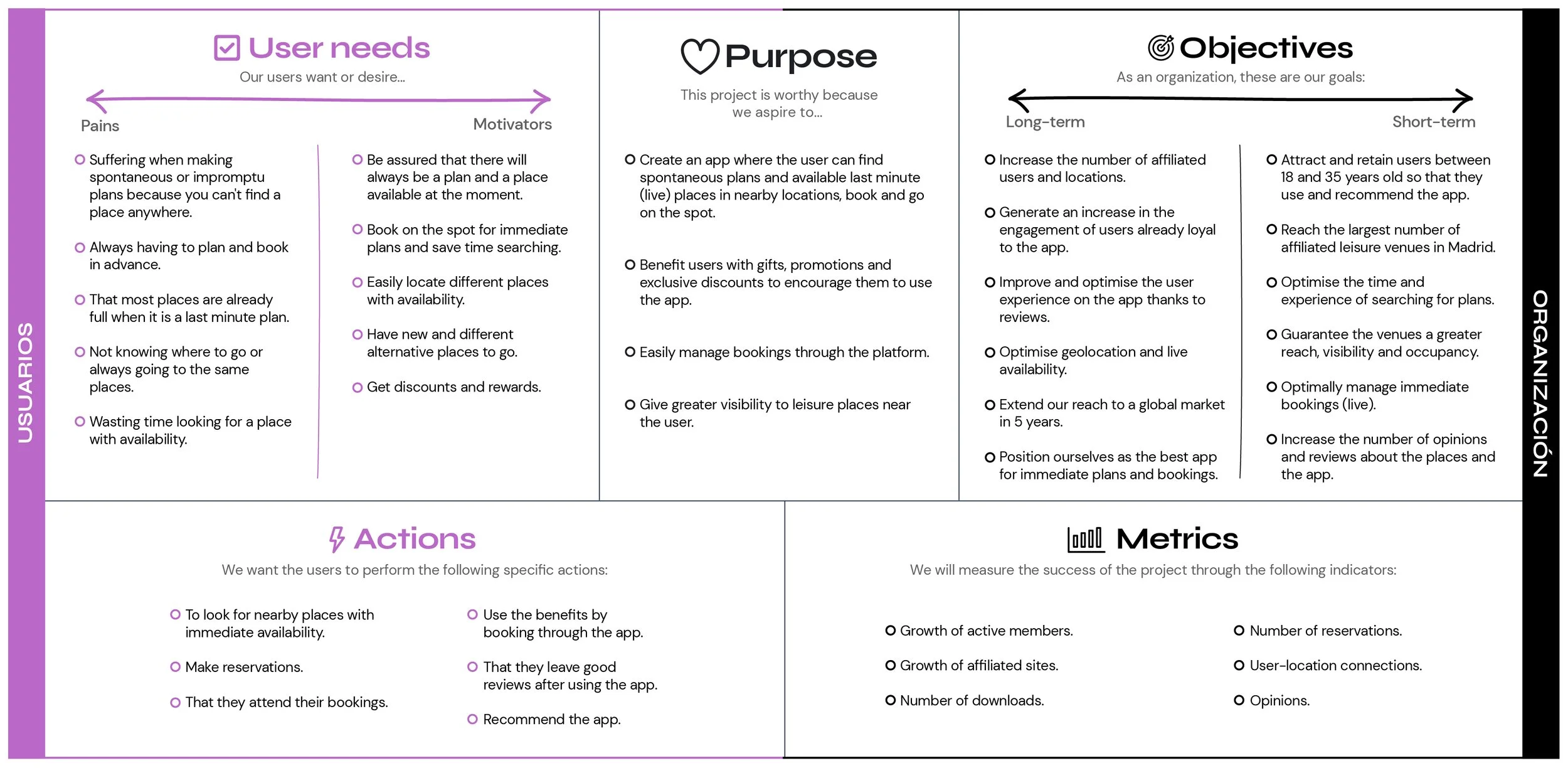
The scope canvas is a Canvas specialized in connecting user needs with business objectives. It is a tool designed as the backbone of User Experience and Service Design projects.
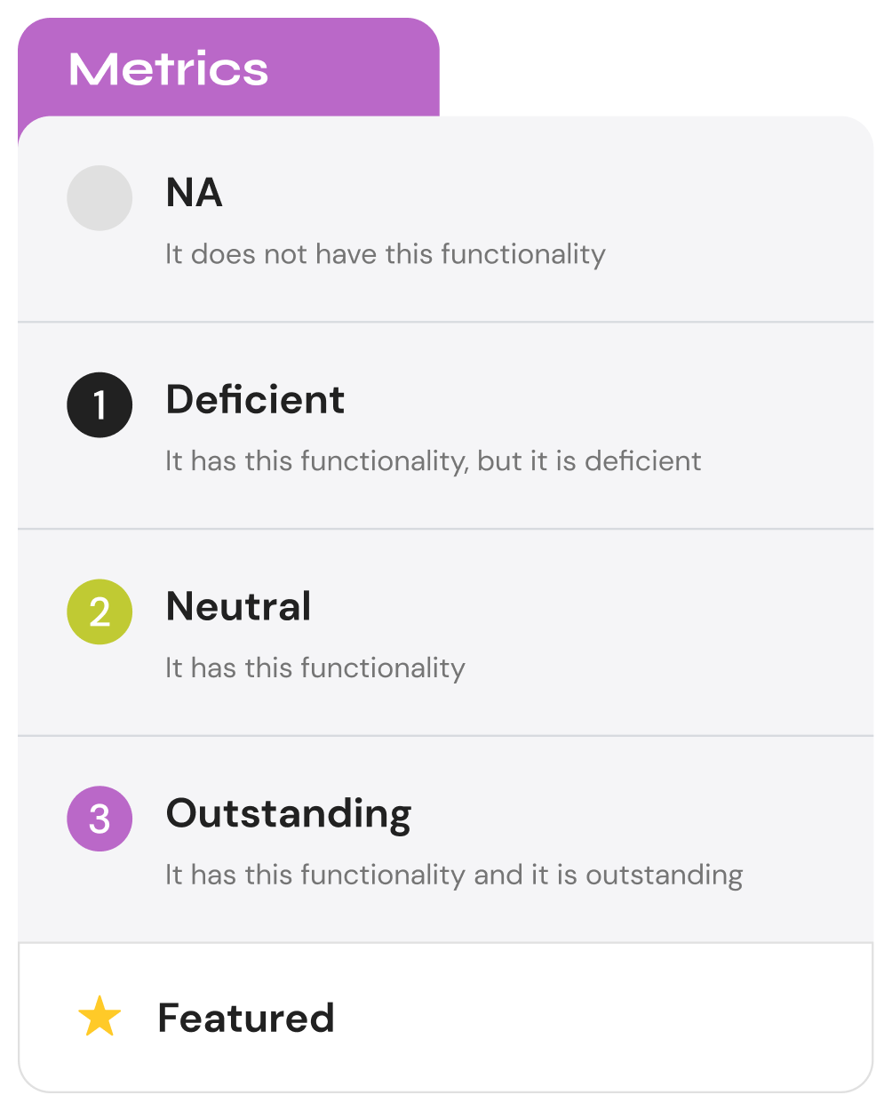
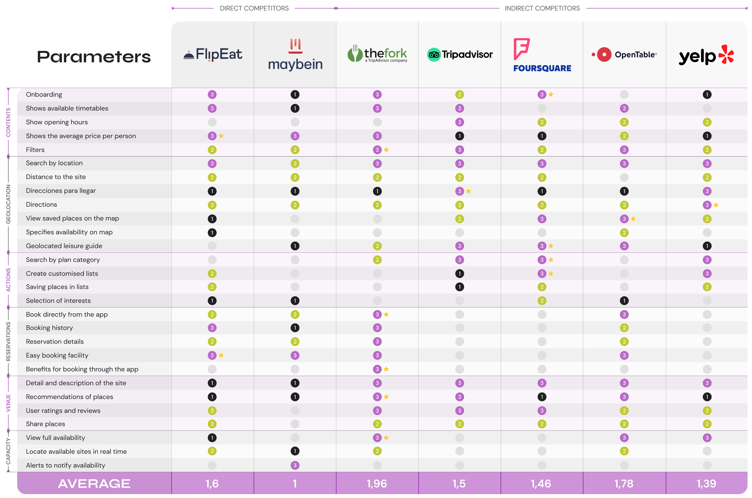
The following comparative analysis evaluates the functionalities of seven different digital products. This is in order to analyse strengths and weaknesses, find solutions for our proposal and ensure that we implement best practices to meet the needs of our product users.
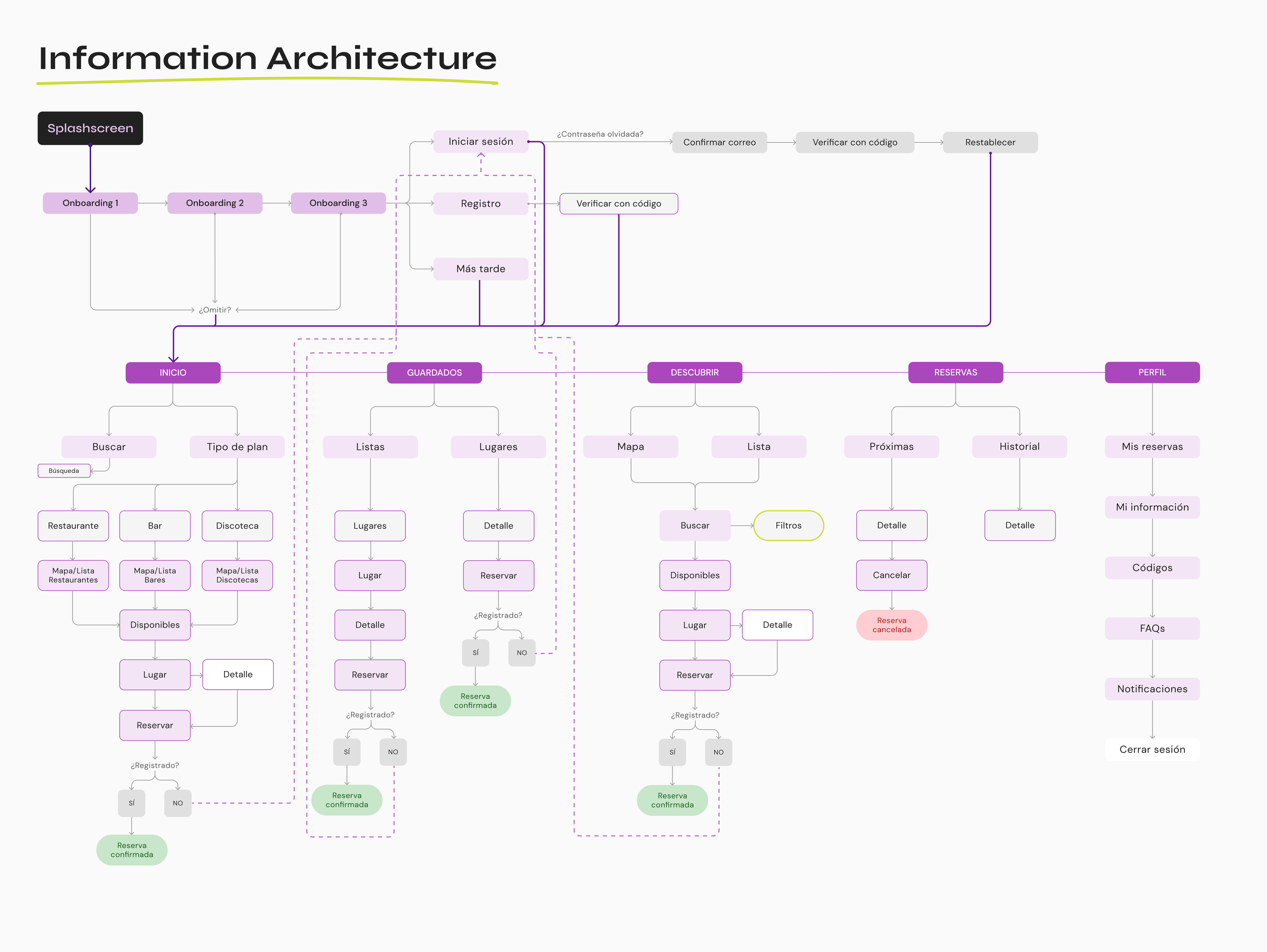
Planow app architecture
The architecture is the study, analysis, organization, arrangement and structuring of the information and all the elements that make up the digital product or service. It determines the contents and functionalities of the product, facilitating access to them through different systems.
It is the creation of an intuitive and coherent navigation structure that supports project objectives and user needs.
Its main objectives are to help the user understand where he is and what is around him, to facilitate the user's decision making and planning. It serves as a vital navigation tool, helping users find their way through the various features and functionalities within the app. The sitemap enables a seamless user experience by guiding them to the desired sections and ensuring efficient interaction.
User experience (UX)
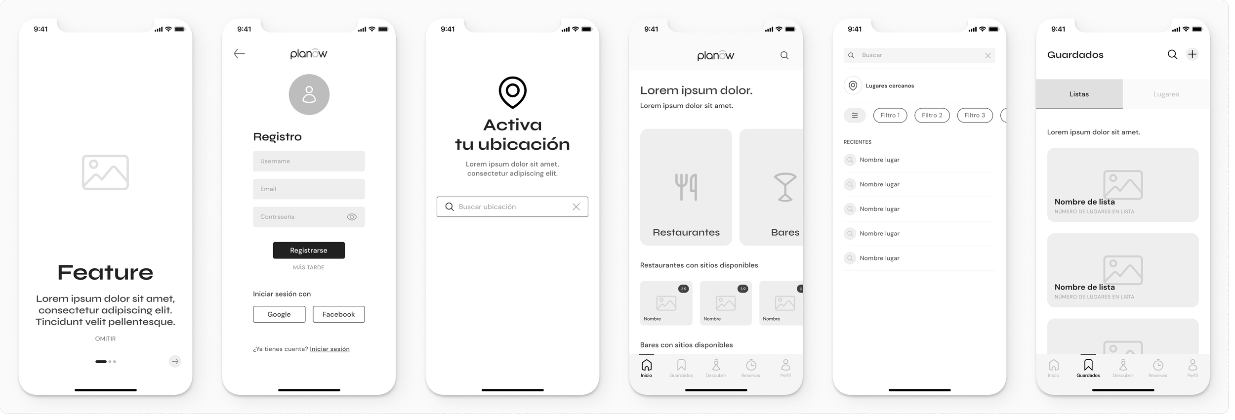
In order to create a more efficient and user-friendly app for users who want to make last-minute reservations, I have taken this into consideration:
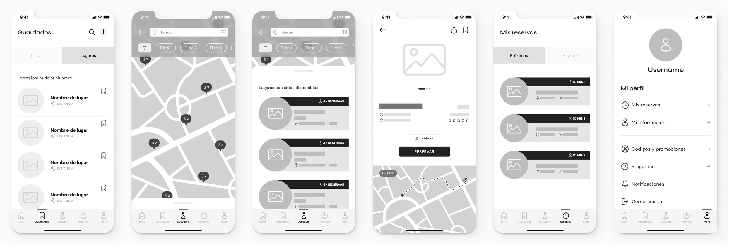
Optimized user flows and clear information hierarchy. Users must be able to find available options nearby and complete reservations quickly.
Intuitive navigation and a straightforward reservation process. Reduce steps and pain points to ensure a seamless experience.
Include features such as real-time availability updates, location-based services, and clear confirmation screens to improve the overall experience.
Troubleshooting should be informative. It should guide users to resolve problems quickly.
User Interface (UI)
The UI design had to be visually appealing and consistent with the purpose of the application. A clean and modern aesthetic was used to convey the trustworthiness and efficiency of the app.
Important actions, such as reserving a spot or viewing details, were prominently displayed with clear call-to-action buttons.
Make it easy for users to identify options by using color coding and visual cues to distinguish available spots from booked spots.
Typography and readability were key. Legible fonts were used and different screen sizes and resolutions were considered.
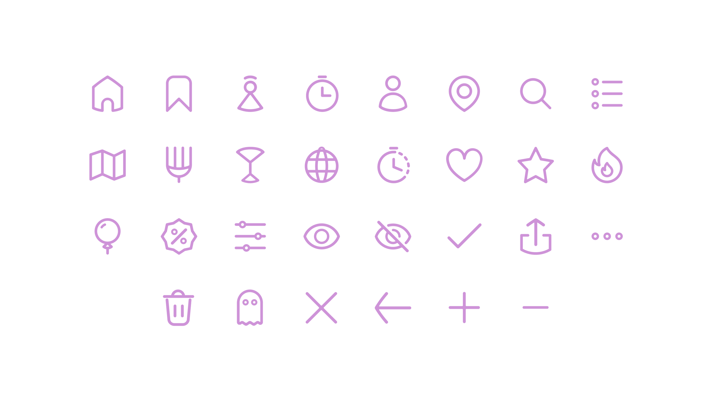
The iconography has been carefully and exclusively designed for this project. Creating intuitive visual symbols and icons to represent actions, objects, or concepts within the app was essential.
Enrich the experience visually with illustrations and graphics related to fun, entertainment, and leisure plans.
In this project, special attention was given to the design of the iconographic family.
From a 32px x 32px grid, each of the icons used in Planow were designed to achieve coherence and visual unity. Rounded shapes and vertices were used to give a sense of closeness and make them more user-friendly and improving the overall user experience.
These icons act as a language. They enhance the user's understanding, interaction, and navigation of the interface by providing a visual shorthand with clarity, consistency, functionality, accessibility, and aesthetics.
The goal is to provide users with a balance of simplicity and efficiency with a smooth and visually appealing experience that encourages quick bookings, even in time-sensitive situations.


From the MVP to the full application design, the primary goal in creating PIanow, the last-minute booking app, was to create a seamless and visually appealing experience that prioritizes speed and efficiency. This included intuitive navigation, simple reservation processes, and clear display of options. The UI needed to be consistent, using icons and color cues to guide users. Testing and user feedback played a critical role in refining the design to ensure it met the needs of users looking to make quick, last-minute reservations.
Feel free to check out the full version of the project here! 😉


